Super Regionals Booth Design
Tags: Think, Business, and DesignPersonhours: 15
Task: Design a theme and layout for super regional pits
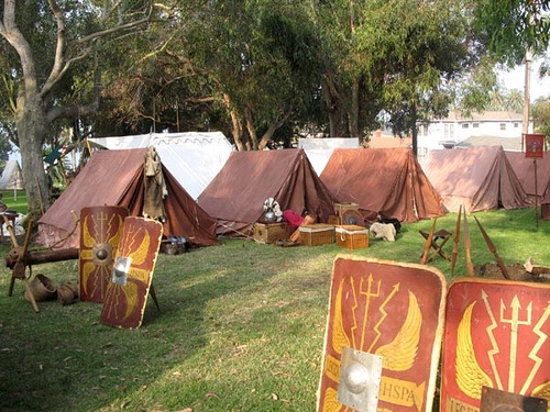
A year or two ago Imperial advanced to Super Regionals, bringing along a few Iron Reign members. While teams get excited and have a lot of fun at Regionals, it's nothing compared to the displays found at super regionals. We've grown into our cyber-Roman theme this season, and Omar is currently working on a logo to match our new color and feel. Hats won't be enough at this level though, we've got to step it up a notch! Austin and I first looked for a base image, first looking up Roman forts, then moving to campsites. The forts weren't as recognizable, and the tents could be set up much easier. We drew most of our inspiration for the booth theme from the image above, credit to Gaius Hibernicus on Flickr.
Having a recognizable theme is important on two points: scouting and sponsors. Sponsors are more likely to be generous if we can point to a display and show them that people will look at our setup and see their names on it. It's the way to thank them for their generosity in the season. When scouting, you want to be remembered. A forgettable team isn't chosen. Super Regionals usually has teams that have already made alliances over the season, so if you aren't one of those, you've got to stand out in both the game and in the pits.
Reflections
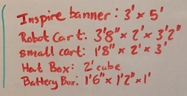
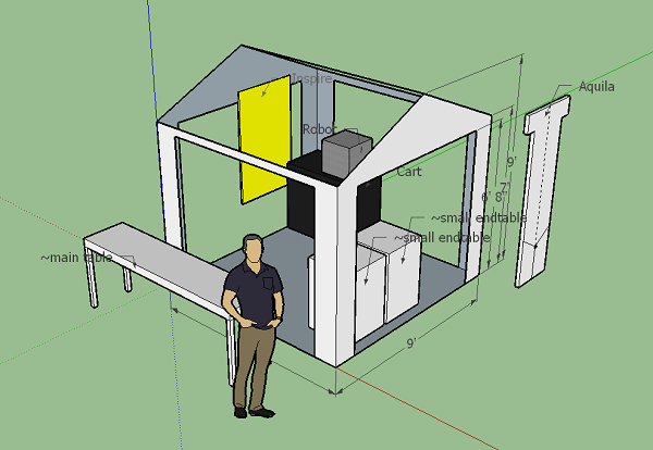
Oddly, this competition has a pit size of 9'x9', not the usual 10'x10', so we will be designing to that measurement, and hopefully expanding it later. Austin designed a base frame structure in SketchUp and I started making models of our carts, banners, and tables to be arranged after. We need enough sign space to display our Inspire banner, sponsors, school banner, and team aquila. The robot cart needs a clear path to the workspace area, and we need space up front for pins, a display with our outreach and robot reveal running, and a trophy display. I've made models for these because we already have them, and have begun the shuffling and brainstorming.
Austin created a Roman style shield in a record time, using old field mats as the core and sawed off broom handles (left over from the hats) to keep them stiff. We ran out of daylight to scrub them clean of dirt, but did that this practice. When we were sure the tape would adhere he covered the front in red duct tape with a gold border. He also mounted an IKEA bowl to the front as decoration, and is planning to round the corners off so he can mount a LED strip along the edge. It already looks really impressive, and we have more materials to make a second if we keep the pace up.
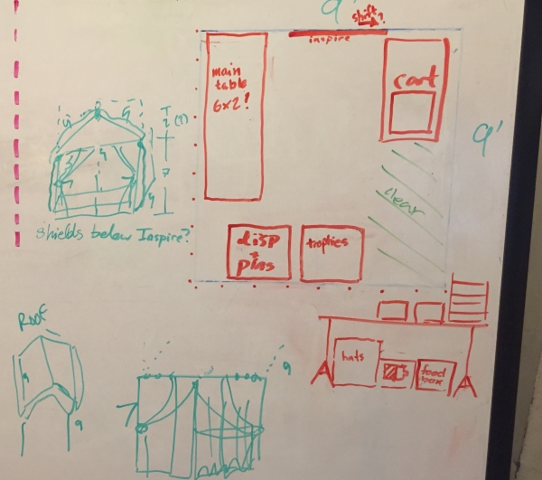
The structural design of the tent was adjusted for simplicity's sake; we're making a cube as large as the competition allows, and hanging tan fabric/ripstop nylon along the different sides to create the tent shape. The PVC supports are going to be wrapped in a worn/tea-stained look material to keep it unified. Our two smaller rolling carts will have our front displays, and since they have shelving, they can serve as storage for the boxes that don't need to get pulled out as often during the competition. We can mount a shield to the front if we want to cover them up. The Inspire banner is bright enough that it can likely be seen easily from the back or side of the tent, the school banner will go across the top above everything, and the aquila will likely go in the front on the left, beside the displays.
